

How to Create a Cohesive Room Aesthetic
Table of Contents
- Start With a Strong Foundation: How to Choose a Color Palette for Home
- Build Your Vision: How to Create a Mood Board for Interior Design
- Choose Decor and Furnishings That Work Together
- How to Mix Decor Styles Without Clashing
- Maintain Visual Flow and Balance Across Rooms
- Budget-Conscious Cohesion: Build Your Aesthetic Affordably
- Common Mistakes That Break Cohesion
- Conclusion
Last Updated: August 29, 2026
Start With a Strong Foundation: How to Choose a Color Palette for Home
Creating a cohesive room aesthetic begins with color. Your color palette is the backbone of everything else, furniture, textiles, artwork, and accessories all flow from this foundation. The best approach is to start with neutrals, layer in undertones, then add accent colors strategically.
Identify Your Neutral Base
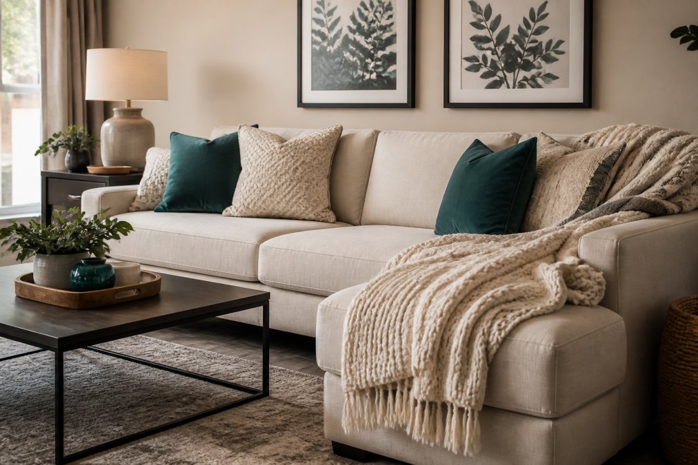
Your neutral base is the largest color area in the room, typically walls, large furniture, or flooring. Common neutral bases include warm whites, soft grays, warm beiges, and soft taupes. The undertone matters enormously, a warm beige reads completely differently than a cool gray, even though both are technically neutral.
Start by choosing one neutral for at least 60-70% of your room's visible surface (the American Academy of Dermatology). This creates visual continuity and gives your eye a place to rest. PracticalHomeEssentials.com's approach emphasizes this foundation because it's where cohesion actually starts.
Balance Warm and Cool Undertones
Every color has an undertone, either warm (leaning toward yellow, orange, red) or cool (leaning toward blue, green, purple). The biggest cohesion mistake is mixing undertones randomly. A room with both warm and cool neutrals feels disjointed.
Pick one undertone direction and stick with it. If you choose warm neutrals, keep your accent colors warm-leaning too. Cool grays pair with cool blues and greens. Hold paint samples or fabric swatches next to each other in natural light, the undertone becomes obvious when colors are adjacent.
Select Your Complementary Accent Colors
Accent colors are where personality enters. After establishing your neutral base with consistent undertones, introduce 2-3 accent colors maximum. Complementary colors sit opposite each other on the color wheel and create natural contrast without clashing. Warm terracotta complements cool teal. Warm mustard complements cool navy.
Apply the 70/30 rule: 70% of your room should be neutral, 20% should be your primary accent color, and 10% should be secondary accents (aiga.org). This ratio prevents any single color from overwhelming the space while giving it enough presence to feel intentional.
Build Your Vision: How to Create a Mood Board for Interior Design
A mood board is your visual reference system before you buy anything. It prevents expensive mistakes and keeps your choices aligned.
Gather Inspiration Across Digital and Physical Sources
Start collecting images and materials that appeal to you. Pinterest and Instagram are obvious digital sources, but also photograph rooms you encounter in person, friends' homes, hotels, restaurants. Physical materials matter too: fabric swatches, paint chips, actual rug samples if possible.
Pull from five or six different rooms or styles, then look for the common threads. Gather roughly 15-20 images or materials (peer-reviewed research). This is enough to see patterns without becoming overwhelming.
Identify Common Threads in Your Selections
After gathering, step back and look for what connects your choices. Are most images warm-toned or cool-toned? Do they feature lots of texture or minimal surfaces? Are the spaces minimalist or layered?
The common threads reveal your actual aesthetic preference. Create a physical or digital mood board by arranging these images and materials together. This becomes your reference document when shopping. When you encounter a potential piece, ask: "Does this fit the mood board?" If it doesn't clearly belong, skip it.
Choose Decor and Furnishings That Work Together
Cohesion isn't just about color, it's about how pieces relate to each other through texture, scale, and material.
Focus on Texture and Materials
Texture creates visual interest and prevents a room from feeling flat. A room filled with rough, natural textures (raw wood, linen, jute) feels different from one featuring smooth, polished surfaces (glass, metal, silk). If 60% of your room features natural, tactile textures, keep the remaining 40% consistent with that aesthetic.
Materials reinforce cohesion. A room with mostly wood furniture reads differently than one with mostly metal or upholstered pieces. If wood is your primary material, introduce secondary materials that complement it, perhaps metal accents or natural fiber textiles.
The Luxurious Velvet Rectangular Shaggy Plush Carpet Rug from PracticalHomeEssentials.com exemplifies this principle. Its soft, tactile surface adds texture while the neutral tone anchors the room's color palette. A rug like this works across multiple design styles because it solves two cohesion problems simultaneously: it provides texture consistency and reinforces your neutral base.

Match Scale and Proportion to Your Space
Scale is how large or small objects are relative to your room and to each other. A massive sectional in a small bedroom breaks proportion. Cohesion requires that pieces feel appropriately scaled to each other and to the space.
In small spaces, choose furniture and decor that doesn't overwhelm. In larger spaces, small pieces can look lost. Proportion also applies to accessories. If your room features large-scale furniture, pair it with medium to large-scale decor. Small trinkets scattered around large pieces create visual noise rather than cohesion.
How to Mix Decor Styles Without Clashing
Most people think cohesion means everything matches exactly. Actually, the best rooms blend multiple styles while maintaining visual unity.
Use Transitional Design as Your Bridge
Transitional design is the bridge between traditional and modern. It borrows clean lines and simplicity from modern design while incorporating warmth and detail from traditional styles.
If you're mixing a modern sofa with traditional artwork, transitional pieces act as connectors. The Fennco Styles Rhombus Diamond Knit Modern Fringe Throw from PracticalHomeEssentials.com bridges the gap. Its geometric pattern reads modern, but the fringe and knit texture add warmth. It works with both styles simultaneously.

Layer Pieces You Actually Love
The best rooms are designed by layering pieces that genuinely resonate with you. Start with anchor pieces, your sofa, bed, major furniture. These set the style direction. Then layer in secondary pieces that either echo that style or provide intentional contrast.
The key is creating visual connections. If you pair a modern sofa with a traditional mirror, ensure another element bridges them. Perhaps your throw pillows echo the mirror's ornamental quality while maintaining the sofa's clean aesthetic.
Maintain Visual Flow and Balance Across Rooms
Cohesion isn't just about individual rooms, it's about how rooms relate to each other.
Create Continuity With Repeating Elements
The easiest way to maintain flow across rooms is to repeat key elements. Your neutral base color doesn't need to be identical in every room, but it should be recognizably related. If your living room features warm grays, your hallway might use warm beige.
Similarly, repeating accent colors or textures across rooms creates continuity. If your living room features deep teal accents, introduce that same teal in your bedroom or hallway. Material consistency also matters. If your living room emphasizes natural wood, carrying that through to your bedroom and hallway creates flow.
Apply the 70/30 Rule for Cohesion
The 70/30 rule works not just within rooms but across your entire home. Seventy percent of your visible color and material palette should remain consistent across spaces. Thirty percent can shift and change. Your living room and bedroom might both feature warm grays and teal accents, but the bedroom's secondary accent might be mustard while the living room uses cream.
Budget-Conscious Cohesion: Build Your Aesthetic Affordably
Cohesion is about intentionality and strategy, not price tags. Budget constraints often force better design decisions because they demand thoughtfulness.
Start With Basics, Add Character Gradually
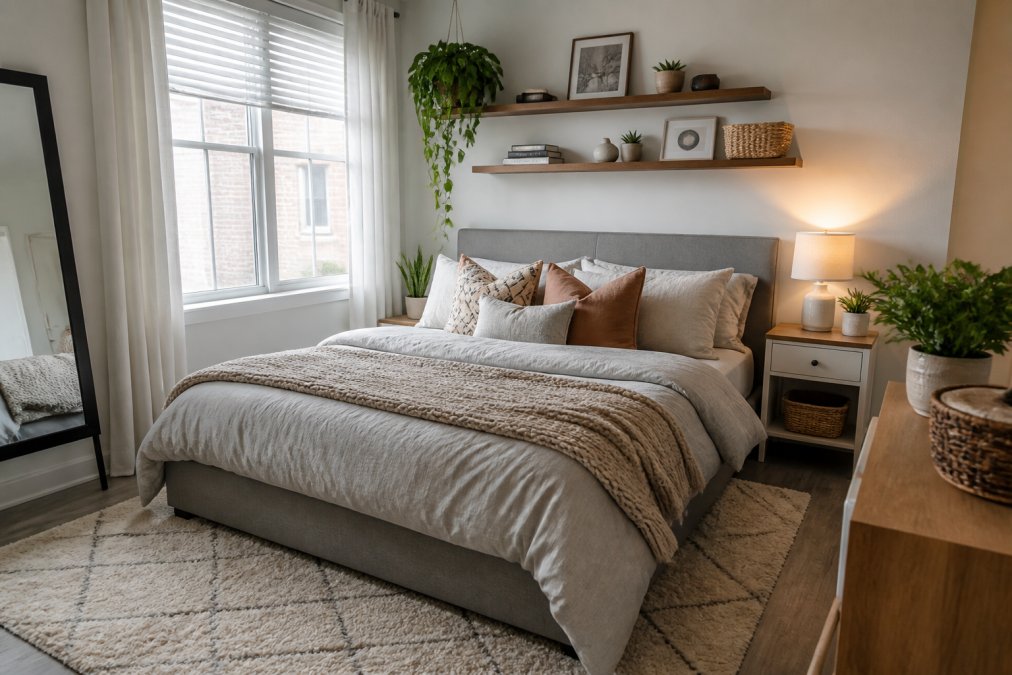
The most cost-effective approach is to invest in neutral basics first, then add character slowly. Your foundational pieces, bed frame, sofa, dining table, should be neutral, durable, and timeless. Once basics are in place, add personality through affordable, replaceable pieces like throw pillows, rugs, artwork, and textiles.
Build gradually. A room doesn't need to be complete immediately. Spaces that evolve over time often feel more cohesive because each piece was chosen deliberately.
Invest in Anchor Pieces That Work With Everything
Anchor pieces deserve your investment because they'll serve you for years. A quality neutral rug, a well-made sofa in a timeless color, a solid wood coffee table, these pieces transcend trends.
PracticalHomeEssentials.com offers pieces designed for this exact purpose. The Luxurious Velvet Rectangular Shaggy Plush Carpet Rug works with virtually any color palette and style because its neutral tone and soft texture complement rather than compete. A rug like this is worth the investment because it won't need replacing when your accent colors shift.
Common Mistakes That Break Cohesion
Mixing undertones randomly. A room with both warm and cool neutrals feels disjointed. Decide on one undertone direction and maintain it.
Ignoring scale and proportion. Oversized furniture in small spaces or tiny accessories in large rooms breaks visual balance.
Adding too many accent colors. Three accent colors maximum. Beyond that, a room feels chaotic rather than intentional.
Buying pieces without a reference system. Shopping without a mood board leads to impulse purchases that don't fit.
Neglecting texture. A room with only smooth surfaces or only rough textures feels one-dimensional. Layer textures while maintaining consistency in material type.
Forgetting about lighting. Colors look different under different lighting. Test colors in your actual space before committing.
Creating a cohesive room aesthetic is about making deliberate choices that reinforce each other. Start with a neutral base, establish consistent undertones, and layer in accent colors strategically. Use a mood board to maintain focus, then build gradually with anchor pieces that work across styles. The result is a space that feels intentional and harmonious, where every piece belongs.
At PracticalHomeEssentials.com, we understand that cohesion matters more than individual pieces. Our curated selection focuses on items that work together, neutrals that anchor, textures that layer, and accent pieces that reinforce your overall vision. Start with foundational pieces like quality rugs and textiles, then build your aesthetic affordably over time. Choose options to explore pieces designed to work with everything you love.
Frequently Asked Questions
What is the 70/30 rule in decorating?
The 70/30 rule means 70% of your room should use your neutral base colors and cohesive design elements, while 30% features accent colors and statement pieces. This ratio keeps your space unified without looking monotonous. For example, neutral walls and furniture make up the bulk of the room, while artwork, throw pillows, and decorative accents add personality. This balance creates visual harmony while allowing your personality to shine through without overwhelming the space.
How do you tie different rooms together in a house to create a cohesive room aesthetic?
Maintain visual flow by repeating key design elements across rooms: use the same neutral base colors throughout, carry accent colors into adjacent spaces, and repeat textures and materials. For instance, if your living room features warm undertones and geometric patterns, echo those same undertones and a similar pattern style in your entryway or hallway. This creates a unified theme while allowing each room its own focal point. Consistency in lighting schemes and furniture scale also strengthens cohesion between spaces.
What makes a room look cheap or disjointed?
Rooms look disjointed when they lack a unified color palette, mix competing design styles without intention, use mismatched scales and proportions, or combine too many textures without balance. A hodgepodge of random decor pieces without common threads creates visual chaos. Avoid buying pieces solely because they're inexpensive or trendy; instead, choose items that fit your chosen aesthetic and color scheme. Investing in a few quality anchor pieces, like a cohesive rug or throw blanket from PracticalHomeEssentials.com, creates a foundation that ties everything together affordably.
How do you choose a color palette for a cohesive home?
Start by selecting a neutral base color for walls and large furniture, then choose 2-3 accent colors that complement it. Consider whether you prefer warm undertones (creams, warm grays, soft beiges) or cool undertones (cool whites, cool grays, soft blues). Use a mood board to test how colors work together before committing. Ensure your accent colors appear in multiple rooms to create continuity. This structured approach prevents a disjointed look and makes it easier to add new pieces that fit your aesthetic over time.
This article was written using GrandRanker